How to Design Smarter EdTech That Aligns UI with Education Goals
EdTech design shapes how students interact with knowledge. A clean layout is helpful, but meaningful design goes further. Smart UI guides students, supports focus, and makes complex tasks feel manageable.
When platforms reflect how students learn and how teachers teach, usability becomes a direct support for progress. Students appreciate it when they can hire human essay writer in Florida or progress through their online courses without getting lost in confusing menus or disjointed layouts. A smooth, well-structured interface keeps the learning flow uninterrupted. It gives students more time to think, reflect, and actually absorb what they're being taught.
Why UI Design Matters in EdTech
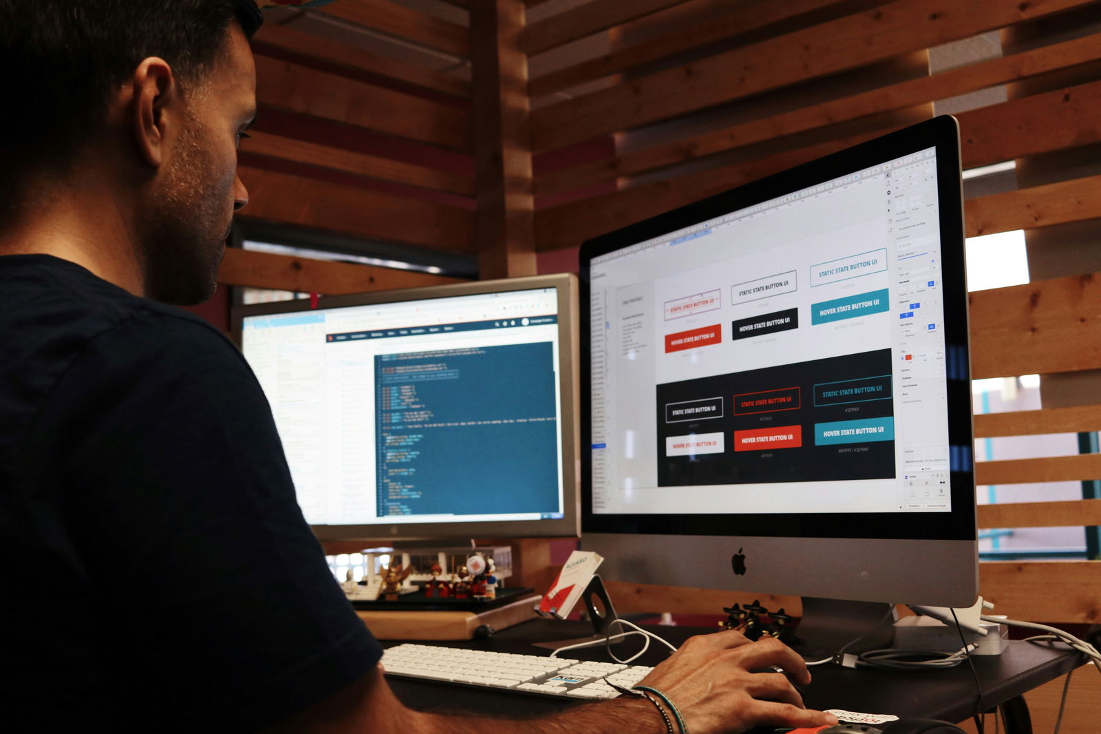
User interface design plays a direct role in how students experience learning. When screens feel cluttered or menus are inconsistent, students lose focus. They end up spending valuable time trying to navigate the platform instead of absorbing the lesson itself.
Effective UI removes friction and keeps learners in a steady rhythm. A progress bar, a clearly marked quiz button, or even a visual cue for task completion can make a huge difference. When these elements work together, they help students move forward with clarity and confidence.
Design details communicate more than style. Button placement, color consistency, and spacing shape behavior and comfort. Predictable layouts reduce stress. Clear labels encourage action. When students feel guided, not overwhelmed, they stay engaged longer and absorb more.
In fully digital classrooms, the platform is the environment. There's no in-person help or verbal instructions to rely on. Design has to support learners in real time, and it does that best when every element serves a learning purpose.
Common UI Mistakes That Disrupt Learning
Even strong educational platforms can struggle if their interface creates friction. When the layout gets in the way, students lose time, energy, and focus.
Here are common design issues that interrupt the learning flow:
- Students are forced to click too many times to complete a basic action.
- Interface elements compete for attention instead of guiding the user naturally.
- Visual clutter overwhelms users, especially during timed tasks or tests.
- Tools prioritize trendy features over educational clarity and function.
- Feedback mechanisms are vague or missing, leaving users confused.
These aren't just small annoyances. They shape how students experience the material. A confusing layout can lead to missed steps, skipped lessons, or repeated questions. Every extra click pulls students further from the goal.
Fixing these issues starts with understanding how students think and what educators need. A smooth experience isn't about minimalism; it's about precision. Smart design supports learning by staying out of the way and keeping the student's attention where it belongs.
Aligning UI with Real Education Goals
Designing with education in mind starts by asking the right questions. What is this feature helping the student do? What learning objective is it tied to? If those answers aren't clear, the interface becomes just another obstacle.
UI should support the rhythm of learning. That means making it easier for students to follow instructions, stay organized, reflect on their progress, and move toward outcomes. It also means offering feedback in ways that help students grow, not just showing a red X when they get something wrong.
A layout that aligns with learning goals doesn't just feel smoother. It reinforces skills, boosts motivation, and helps students understand how each task fits into a larger academic picture.
Here are the key elements that connect UI design with real educational impact:
- Progress tracking tied to learning outcomes;
- Built-in feedback that teaches, not just corrects;
- Time-on-task support tools;
- Visual consistency across modules;
- Smooth transitions between activities.
These features don't need to be flashy. They need to be intentional. When students and instructors both understand where they are and what's next, the entire experience feels more focused.
That's why many developers now bring in education consultants during the early stages of product planning. They help reframe design conversations around clarity, not complexity. When design serves pedagogy, results follow.
Smart UI Strategies That Actually Work
Some UI strategies consistently improve the user experience in EdTech because they reduce friction and support learning. Below are five that work well across student ages, academic subjects, and digital skill levels.
1. Consistent Layouts Reduce Cognitive Load
When every module, screen, or activity follows the same basic layout, students don't need to relearn the platform as they move through it. Consistency lowers stress and increases speed. It also supports students with learning differences, who often rely on routine to stay engaged.
A platform with a consistent page design feels easier to use, even when the content becomes harder. That helps learners focus on thinking, not on finding where the "submit" button moved this time.
2. Real-Time Feedback Improves Retention
Students engage more when the platform reacts to their input. Micro-feedback, like highlighting the right answer, offering a hint, or explaining a mistake, gives students a chance to pause and learn in the moment.
This feedback loop doesn't have to be complex. Even a simple "You got it!" or "Try checking step two again" can help. When feedback feels personal and timely, students are more likely to reflect and adjust. That reflection is where real learning happens.
3. Visual Hierarchy Directs Attention
Strong design uses contrast, spacing, and font size to show what matters most. A clear heading tells students where to start. A highlighted box helps them notice key info. Intuitive visual hierarchy keeps learners from scanning aimlessly.
Without it, students spend energy figuring out what they're supposed to be looking at. With it, they can move smoothly through instructions, content, and tasks with fewer mistakes and more confidence.
4. Context-Aware Navigation Supports Flow
One of the most common UI mistakes in EdTech is static navigation. What works in a reading module might feel clunky in a math quiz. Students benefit when the platform adapts to the type of activity, hiding unnecessary tools, reducing clicks, or surfacing relevant shortcuts.
For example, a writing section might expand the notes panel and offer quick access to sources, while a timed quiz keeps the interface minimal and distraction-free. Adaptive design keeps students grounded in what they're doing now, not lost in everything else the app offers.
5. Mobile-Friendly Isn't Optional
Many students access educational platforms from phones, sometimes exclusively. If your UI doesn't perform well on smaller screens, it fails them entirely. Mobile-friendly design isn't just about shrinking content; it's about rethinking the experience.
Tap targets need space. Scrolling should feel intuitive. Text should resize smoothly. These aren't extras. They're essential for accessibility, especially for students learning on the go, in transit, or without steady access to a laptop.
Ryan Acton, an education expert from the EssayHub team, often consults developers on these types of UI decisions. As someone who also works with students through the essay writing service, he's seen firsthand how design can either motivate or exhaust a learner. His advice? Build tools that feel supportive.
Personalization That Supports, Not Distracts
Personalized features can help students feel seen, but only if they're meaningful. Too often, EdTech tools promise customization, then deliver shallow settings that don't actually improve learning.
Good personalization is quiet but effective. It remembers where a student left off, adjusts pacing when needed, or offers tailored content suggestions based on performance. It never overwhelms the user with too many choices or flashy recommendations.
Students should feel like the platform knows how they learn, not just what they clicked. Simple features like saved notes, adaptive quizzes, or dashboard reminders can make a big difference. Personalization works best when it gently guides students forward, not when it tries to predict every step.
When done right, it builds confidence and creates a more focused, less stressful learning space.
Testing with Students and Educators
Even the best UI ideas fall flat if they don't work in real classrooms. That's why testing with actual students and teachers is essential.
Educators spot workflow issues that developers often miss. Students reveal friction points just by trying to finish a task. Their reactions tell you whether your design helps or gets in the way. Some features might look great in a prototype but confuse learners once they're live.
Start testing early and keep it simple. You don't need a full product launch to get feedback. One lesson or task is enough to gather insights. Watch how users navigate, where they pause, what they skip, and when they get stuck.
Feedback loops with real users allow you to adjust before problems scale. If students hesitate or get frustrated, something needs to change. Clear UI leads to better results, and better results keep students coming back.
Conclusion
Smart EdTech design doesn't happen by chance. It's shaped by real users, guided by education goals, and tested to remove friction at every level.
Instead of focusing on what looks impressive, focus on what works. Give students the tools to navigate, respond, and reflect without disruption. Design that feels intuitive gives learners the space to grow, and that's what education platforms should always aim for.
Smarter UI starts with a shift in mindset: build for clarity, not complexity. The learning experience will speak for itself.