How Color and Icons Shape Student Learning
Educational materials aren’t just containers for information. They influence how students absorb, organize, and retain what they learn. Visual elements like color and iconography affect comprehension, memory, and overall engagement.
This matters in both digital and print resources. Whether it’s a textbook, a study app, or an online essay writing service platform, the way information looks can either support learning or create unnecessary friction. Visual design, when intentional, gives students a cognitive advantage.
How Color Supports Learning
Color Builds More Than Style
Color is often dismissed as decorative, but in learning environments, it serves real cognitive functions. Different colors trigger specific reactions in the brain, supporting emotion, attention, and categorization.
For example, warm tones like red and orange can increase alertness, while cool tones like blue and green help with focus and calm. Designers use this knowledge to cue urgency, highlight key information, or reduce mental fatigue during long study sessions.
In student resources, color plays a functional role in reinforcing meaning and structure.
Color Supports Memory and Focus
Memory depends on how well information is organized and encoded. Color helps chunk related content, distinguish between concepts, and guide the eye. Used effectively, it strengthens memory formation by giving the brain more ways to group and recall data.
Color-coded systems in study guides or diagrams allow students to quickly find what they need. Repeated use of consistent color for categories (such as topics, subjects, or levels of importance) can reinforce long-term retention.
Resources that ignore color hierarchy often feel cluttered or disjointed. When the visual system is overloaded, focus drops and comprehension slips.
Accessibility Demands Smart Color Use
Color also affects accessibility. Poor color contrast, inconsistent usage, or overload can make learning harder for students with visual impairments or cognitive processing differences.
Designers must think beyond aesthetic preference. Accessible color palettes follow contrast guidelines, avoid color-only categorization, and provide alternative cues like shapes or text labels.
A color-rich environment should not exclude students. Effective color choices meet both design goals and inclusion standards, making the resource usable for everyone.
The Role of Iconography in Clarity
Icons Do the Work of Words
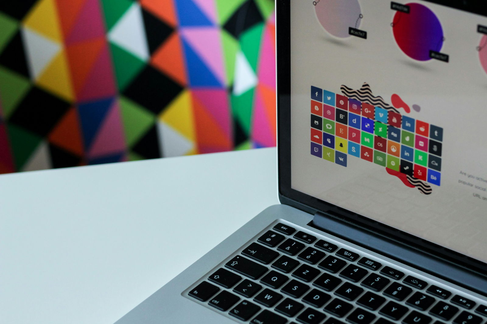
Iconography helps students process information faster. A well-designed icon can replace a line of text, speed up navigation, or explain a function at a glance. In an educational context, that saves time and reduces cognitive strain.
Icons serve different functions depending on context. They can signal types of content (lecture, quiz, reading), actions (download, share, edit), or statuses (completed, in progress). When used consistently, they become part of the learning system itself.
Clarity matters. Generic or abstract icons often confuse students rather than help. Icons work best when their meaning is immediately understood.
Icons Reduce Instructional Load
Students shouldn’t need a legend every time they use a new platform. Familiar visual cues build intuition, allowing students to focus on content instead of figuring out how to navigate it.
In structured learning platforms, icons support guidance without adding extra explanation. A quiz icon tells you what to expect. A warning symbol highlights a due date. These quick signals reduce the burden on text, which is often already dense in academic contexts.
Done well, icons turn passive visuals into active helpers. They guide attention, simplify instructions, and make educational environments more user-friendly.
Design Principles That Guide the Eye
The Role of Consistency in Visual Design
Random design is worse than minimal design. When colors or icons shift meaning without warning, it breaks trust and increases confusion.
Students rely on predictability. A blue sidebar shouldn’t mean “resources” on one page and “deadlines” on another. Icons should not shift in style or function across modules or platforms. Consistency gives students a visual map of how information is structured and how to move through it.
In both printed and digital materials, consistent visual design is a form of communication. It says: this platform respects your time and mental bandwidth.
Visual Hierarchy Affects Reading Flow
Good educational design guides the eye. Typography, layout, spacing, and especially color and icons all work together to create a reading path. That path affects how much information students absorb and how quickly.
Without a clear hierarchy, students may struggle to identify where to begin or what deserves their attention. That’s where visual cues come in. Color helps separate headings from body text, signals topic changes, and emphasizes key terms. In the same way, icons reinforce structure by clarifying what each section covers and guiding attention to specific actions or concepts.
Well-structured visual hierarchy reduces reading fatigue and supports skimming, which is especially important when students are reviewing long materials on a deadline.
Why Students Respond to Visual Clarity
Students juggle multiple courses, platforms, and materials daily. Confusing visuals cost them time and energy. Clear, intentional design gives them tools to learn faster, remember more, and reduce stress.
Color palettes and icons are not superficial details. They influence the entire user experience. When used effectively, they create structure, reduce overload, and help students focus on what matters most.
When design supports navigation and reinforces content, students can move through material with greater confidence. A well-structured interface keeps their focus on learning rather than figuring out how to use the tool, which leads to stronger outcomes across subjects.
How Design Influences Student Engagement
Visuals Influence Student Motivation
Design influences both how students understand material and how motivated they feel to engage with it. When materials look polished, welcoming, and easy to navigate, students are more likely to engage. Poor layout, weak contrast, or visual clutter can signal low quality, causing students to tune out before they’ve even started.
Colors and icons make first impressions. A modern, accessible interface tells students the platform was built with their needs in mind. When students feel seen in the design, their willingness to use the resource increases.
Motivation often depends on small cues. A simple visual refresh can mean the difference between a student ignoring a page and fully diving in.
When Visuals Support Emotional Cues
Colors and symbols also influence how students feel while learning. A calming background palette can reduce anxiety during a difficult assignment. Icons that signal progress, like checkmarks or success badges, can build momentum.
These emotional reinforcements help students stay on track. Positive visual feedback, even when subtle, reminds students that they’re making progress. This is especially important for longer learning sessions or overwhelming topics.
Thoughtful design guides students through the process while also reinforcing emotional stability during challenging tasks.
Good Design Keeps Students Coming Back
Design also plays a role in habit-building. The easier a resource is to use, the more likely students are to return. Familiar icon placement, consistent color signals, and intuitive layouts make educational tools feel comfortable and reliable.
This is especially true for self-guided learning platforms. If the student has to relearn the interface every time they log in, their attention shifts away from content and toward problem-solving navigation. That breaks focus and slows learning.
When visuals support rhythm and familiarity, they help turn academic tools into part of a student’s regular routine.
Case Example: Clear Design in Writing Platforms
Writing platforms are a good test case for visual effectiveness. Students using these tools are often stressed, short on time, and dealing with dense assignments. Visual clarity can ease that pressure.
For example, using consistent color cues for essay sections like thesis, body, and sources helps students mentally organize their work.
Some essay writing service platforms, like DoMyEssay, for example, even use iconography to mark assignment stages (e.g., bidding, writing, delivery). A reliable essay writing service understands that reducing friction in the interface supports better decision-making under deadline pressure.
Key Elements of Student-Friendly Design
The most effective visual systems rely on a few core principles. Here’s what strong student resources consistently include:
1. Meaningful Color Use
- Color serves a functional purpose, not just an aesthetic one.
- It highlights categories, priorities, or actions without creating overload.
- Contrast is always strong enough for readability.
2. Recognizable Icon Sets
- Icons are simple, intuitive, and immediately recognizable.
- Each icon represents one concept and is used consistently.
- Design avoids overuse as icons only appear where needed.
3. Visual Hierarchy and Flow
- Headers, subheadings, and content blocks are visually distinct.
- Icons and colors direct the eye without overwhelming it.
- Layout helps students prioritize, skim, and revisit important sections.
4. Consistency Across Contexts
- Color and icon logic stay consistent across all pages.
- Updates maintain familiar layouts, reducing relearning.
- Visual language becomes part of the platform’s identity.
Resources that follow these principles are easier to navigate, more enjoyable to use, and more effective at helping students stay organized.
Designing for Different Learning Styles
Not every student learns the same way. For visual learners, color-coding and icons directly support understanding. At the same time, verbal learners also benefit when navigation is presented clearly through visual structure.
Beyond learning style, consistent design supports a wider range of needs. It’s especially helpful for students managing ADHD, dyslexia, or executive functioning challenges.
That’s why inclusive design matters. It doesn’t just meet accessibility requirements. It improves the experience for everyone by removing barriers and reducing the distractions that interfere with learning.
Conclusion: Visuals Are Part of the Message
When student resources use visual design strategically, they amplify everything else the platform offers. Color and iconography turn static content into guided, active experiences. They support student confidence, ease cognitive load, and make academic tools more accessible and rewarding.
Design directly shapes how students absorb, organize, and retain information. Strong visuals remove roadblocks, clarify complex tasks, and build motivation through simplicity. The best educational platforms understand this and put as much care into their layout as they do their content.